Retart Lettering
Independent label Retart needed a logo refresh after ten years of its existence. After several directions we decided to go with “scribbled and randomly jumping up and down letters”. It was a reference to handmade and art products, because the main idea behind Retart is to bring art closer to people with presenting contemporary visual artists and their artworks through functional products.
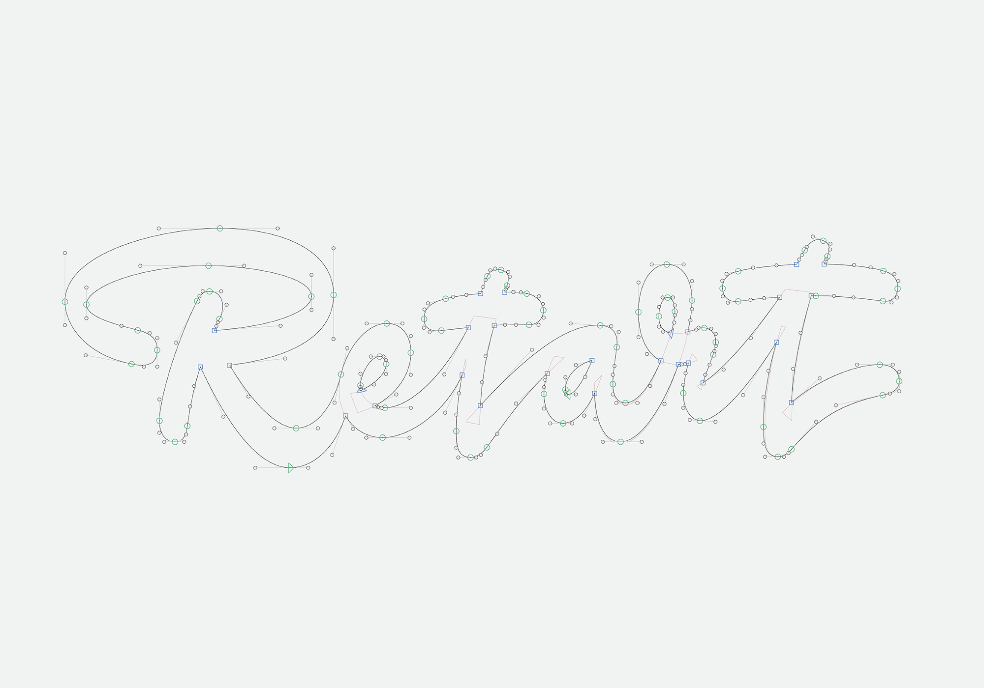
The letters evolved and were modified to look more tidy, later also influenced by a calligraphy a little.
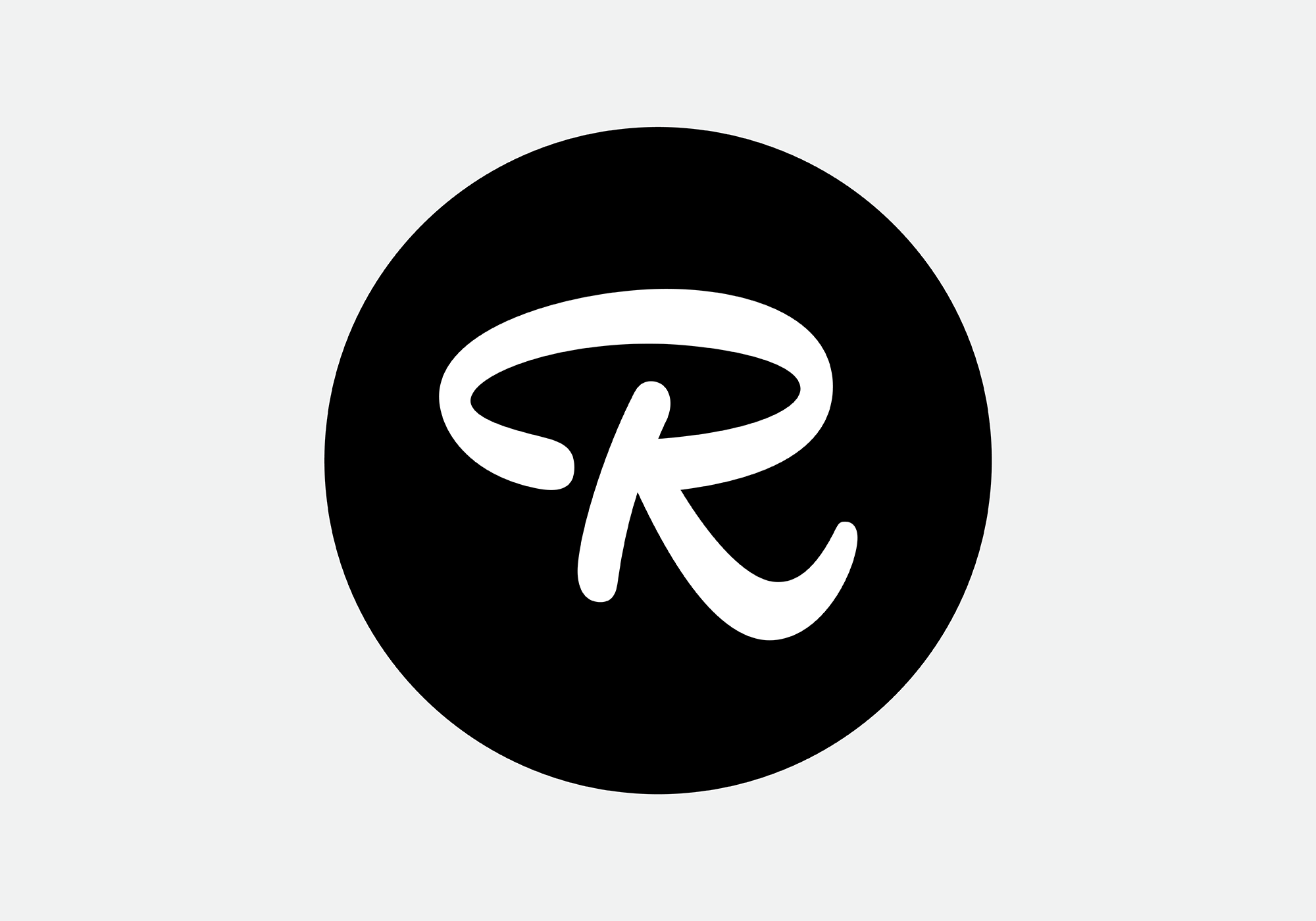
The capital R had a life on its own and was transformed into an “eye” looking shape, referring to visual arts as well.
→ Other DizajnDesign Letterings
Lettering / 26 Dec 2020